

In today's software landscape staying upfront with the latest technologies and design practices is crucial for delivering high-quality user interfaces. Aligning with this principle recently we migrated to React and in the process, we revamped the internal design system of our Wadogo web application by using the Ant Design with React.
Our older web application was built using AngularJS - an MVC framework. While AngularJS served us well for a while, it had its limitations. We were writing separate Models, Views, Controllers, and services files that made our development quite cumbersome.
This article will outline the key reasons behind this migration and highlight the benefits that Ant Design brings to our UI development process. Additionally, we will also discuss the tech improvements we achieved in terms of UX, performance, and developer experience.
React leverages the native JavaScript module system, allowing developers to use import and export statements to manage dependencies. This eliminates the need for a task runner like Gulp and a frontend package manager like Bower to handle module bundling and code splitting. React's ecosystem provides modern build tools like Webpack and Vite, which are highly optimized for bundling, code splitting, and asset management. These tools offer out-of-the-box support for React applications that makes it easier to set up and configure your project.
Embracing the latest standards as part of our continuous improvement efforts, we recognized the need to upgrade our existing IAP-Admin dashboard, which was built on an older AngularJS 1.x to React-based Vision UI. By adopting React, we could leverage the latest standards and practices in UI development that allowed us to onboard new features more efficiently and merge various internal dashboards into a single unified UI.
One of the primary advantages of migrating to Ant Design is the ability to utilize standardized coding styles for React. This streamlines the development process and ensures consistency across the codebase. By adhering to established conventions, we can work more cohesively, collaborate effectively, and maintain code quality throughout the project. Ant Design provides elegant minimalistic UI components to enrich web applications.
Ant Design offers a comprehensive collection of UI components, surpassing the capabilities of iReact components. This extensive component library provides us with a wide range of pre-built elements. Leveraging Ant Design's components enables us to expedite UI development, reducing the time spent on building custom solutions from scratch. Additionally, Ant Design greatly emphasizes user experience, with components designed by professionals using tools like Figma. This ensures that the final product adheres to the latest UX trends and provides a visually appealing and intuitive interface for our users.
With iReact components, we needed to install the chromos library to utilize basic elements like buttons. However, with Ant Design this added dependency became unnecessary. Ant Design includes the @ant-design/icons package, providing a wide selection of icons out of the box. By eliminating the need to rely on additional libraries, our development process becomes easier, reducing potential complexities and improving overall project maintainability.
Increased Developer Productivity: The well-documented component library allowed us to work more efficiently. We focused on implementing business logic and user interactions instead of reinventing the wheel, leading to faster development cycles.
Easier Onboarding of New Features: With standardized DLS and consistent coding styles (Consistent Offer, Affiliate, and Advertiser Pages), onboarding new features and team members becomes smoother and less time-consuming.
Predictable Code Behavior: This predictability reduces the likelihood of bugs and improves code stability, leading to a more reliable and robust UI.
Efficient Client Bundle: Ant Design's pre-built components minimized the need for additional custom code, resulting in a leaner and more efficient client bundle. This improved performance and reduced loading times for end-users. When you open Vision UI for the first time expect normal time to load, but your subsequent revisits will bear minimal changes and waiting time for the Single Page Application.
User experience is paramount in the realm of modern web development. This is where React's Suspense feature comes into play - enhancing user experience by managing the loading state of asynchronous components. We integrated Suspense into our Vision UI to streamline and optimize the loading of various components.
Here's a glimpse of how we employed Suspense in our project:
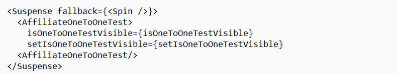 Here, we utilized Suspense to handle the loading state of the
 AffiliateOneToOneTest component. This allows a smoother user experience by displaying a loading spinner while the component is being fetched.
< Suspense fallback={< Spin /> } >
< AffiliateOneToOneTest >
isOneToOneTestVisible={isOneToOneTestVisible}
setIsOneToOneTestVisible={setIsOneToOneTestVisible}
< AffiliateOneToOneTest />
< /Suspense >
Another application of Suspense is in the dynamic loading of routes. We created a higher-order component (withSuspense) to wrap the rendering of routes which ensures that a loading indicator is shown while the route components are fetched asynchronously. This is crucial for a smooth navigation experience, especially in complex applications.
< Route
path="/affiliate-selection"
component={withSuspense(
Authorization(AffiliateSelectionAsync, ['manager', 'superadmin', 'admin']),
)}
/>
The withSuspense function wraps the component in a Suspense boundary providing a fallback loading indicator until the component is ready to be rendered.
Ensuring that our Vision UI remains robust and reliable is a top priority. To achieve this, we've implemented an error-handling mechanism using React's ErrorBoundary. This approach allows us to gracefully handle and recover from unexpected errors that may occur during runtime.
Our custom ErrorBoundary component encapsulates potential errors, preventing them from crashing the entire application. When an error is detected, it gracefully displays an error message to the user while preserving the overall application's functionality.
Here's a simplified version of our ErrorBoundary component:
< ErrorBoundary >
< OfferPrimaryDetails
isOfferPageLoading={isOfferPageLoading}
offerData={offer}
refetchOfferDetails={fetchOfferDetail}
/>
< /ErrorBoundary >
The ErrorBoundary component provides a fallback UI in case of errors, ensuring a seamless user experience even in the face of unexpected issues.
In addition to improving user experience and error handling, we've also integrated the power of React-Query into Vision UI. react-query is a robust library that simplifies data fetching and state management, offering several key advantages:
Efficient Data Loading: react-query's built-in caching and query management significantly improve the efficiency of data loading. This means fewer redundant API calls and faster page loads.
Real-time Data: With react-query real-time updates are a breeze. The library seamlessly manages data updates from the server, providing a smooth and responsive user experience.
Simplified State Management: By centralizing data fetching and state management in one place, react-query reduces complexity and ensures consistency throughout the application.
To demonstrate the benefits of React-Query, here's a snippet of how we used it in Vision UI:
const { data, error, isLoading } = useQuery('offerDetails', fetchOfferDetail);
const {
isSuccess,
isError,
mutate,
isLoading,
data: newAffiliate,
error
} = useMutation((payload) => createAffiliate(payload), {
onSettled: () => {
setIsSaving(false);
setIsSubmitting(false);
}
});
By employing react-query, we have further enhanced Vision UI's performance, ensuring that the data stays updated and is accessible with minimal latency.
We explored how Vision UI has undergone a significant transformation. Our migration to Ant Design has brought standardization, an extensive component library, and a focus on user experience. Additionally, we've demonstrated how <suspense></suspense> enhances the loading experience, the benefits of a resilient ErrorBoundary, and the efficiency gains from using React-Query for data management.
This combination of modern technologies and practices has culminated in a Vision UI that not only meets the highest standards of user experience but also empowers our development team to work more efficiently. As we continue to refine and enhance our UI, Vision UI is a testament to our commitment to delivering top-tier software solutions.
Stay tuned for more insights into the tech stack and innovations that drive Vision UI's success.


Sign up with your email address to receive news and updates from InMobi Technology